


Vuqelari
Echo Design
Echo Design
Couldn't load pickup availability
- Problem Statement
Many learners can improve one screen, but they may struggle when the same design idea needs to appear across several sections or pages. A button style may change without reason, card spacing may feel uneven, labels may follow different patterns, and repeated blocks may lose their shared structure. When repeated elements are not planned carefully, the interface can feel disconnected even if each individual screen has useful content. Learners may also find it difficult to decide which elements should repeat and which elements can change based on context. Echo Design was created to help learners study UI/UX design through repeated patterns, interface consistency, and reusable layout logic.
- Solution
Echo Design teaches learners how to notice, plan, and review repeated interface patterns. The course explains how cards, forms, headings, buttons, labels, section blocks, and navigation areas can follow a steady structure across different screens. Learners study how repeated design choices can support reading, reduce confusion, and make page groups feel more connected. The materials include written modules, visual examples, pattern review tasks, and practical checklists for self-paced study. This tier gives learners a structured way to examine how design decisions repeat across a broader UI/UX system.
- What’s Inside
Echo Design includes a detailed set of UI/UX design materials focused on consistency, pattern logic, and repeated interface structure. The first module introduces pattern thinking. Learners study how digital interfaces often use repeated parts: cards, buttons, labels, form fields, navigation areas, content sections, and status notes. The course explains that repeated parts should not feel accidental. They should follow a shared logic so the user can understand the screen structure without needing to interpret everything from the beginning each time.
The second module focuses on component behavior. Learners study how smaller interface parts can keep the same role across different layouts. A button may guide an action. A label may explain a field. A card may group a short item. A heading may introduce a new topic. This module explains how the role of each element affects its placement, size, wording, and surrounding spacing. Learners review examples where similar elements follow a shared structure and examples where repeated elements look unrelated.
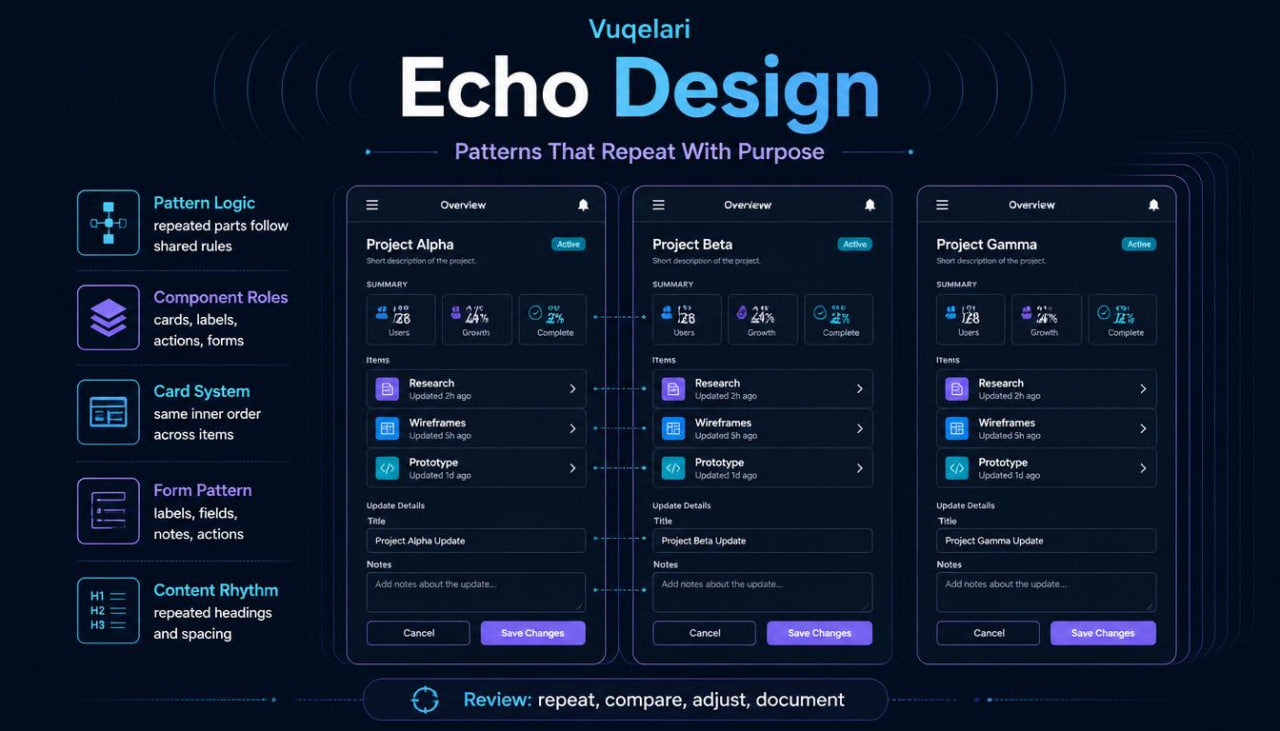
The next module explores card systems. Learners study repeated cards used for topics, choices, summaries, course sections, feature notes, or grouped information. The materials explain how card structure can include a heading, short description, small label, supporting note, and action area. Learners compare balanced card groups with uneven card groups and learn how repeated spacing, text length, and inner order affect the full layout.
Echo Design also includes a module about form patterns. This section explains how labels, input areas, helper notes, grouped fields, and action areas can follow a steady rhythm. Learners study examples where form sections are arranged by topic and examples where field order feels scattered. The course explains how a repeated form pattern can make a longer screen easier to understand because the user sees familiar structure from section to section.
A separate module focuses on heading and text patterns. Learners study how heading size, short descriptions, body text, labels, and list items can follow a consistent structure across different sections. The module explains that text patterns help create reading order. If every section uses a different text style, the page may feel uneven. If text blocks follow a similar rhythm, the learner can see how written content supports design clarity.
The course continues with a module about action patterns. Learners study how main actions, secondary actions, text links, and choice buttons can be placed with a steady logic. The materials explain how repeated action placement helps the user know where to look after reading a section. Learners review examples where actions appear in different places without clear purpose, then compare them with layouts where actions appear in predictable areas.
Echo Design includes a module about visual rhythm across multiple screens. Learners study how spacing, section order, repeated blocks, and content grouping can create a familiar structure across a journey. This module connects earlier ideas from layout, flow, mapping, and visual hierarchy. Learners begin to see how one design choice can echo across several pages.
The practical work in this tier includes several pattern review tasks. One task asks learners to identify repeated interface elements inside a sample layout. Another task asks them to compare two card groups and describe where the pattern changes. A third task asks learners to revise a form section so labels, helper notes, and fields follow the same rhythm. Another exercise asks learners to create a small pattern sheet for headings, cards, buttons, and form blocks.
The tier includes a pattern checklist. This checklist asks: Do repeated elements share the same role? Are similar cards built with similar inner order? Do form labels and notes follow a steady structure? Are action areas placed in a consistent way? Are visual changes connected to a real content difference? This checklist helps learners review whether variation supports meaning or creates confusion.
A second checklist focuses on content rhythm. It asks whether headings are written in a similar style, whether descriptions have a useful length, whether repeated blocks feel balanced, and whether section spacing stays steady. A third checklist focuses on multi-screen review, helping learners look at whether similar screens follow shared layout logic across a full journey.
A glossary section is included with terms such as pattern logic, component role, card system, form pattern, heading rhythm, action pattern, repeated block, variation, consistency, and interface system. Each term is explained in plain UI/UX language with a short practical context.
The recap section brings the course together by showing how repeated interface decisions can support a more connected user experience. Learners finish this tier with a stronger method for reviewing whether design choices work as isolated elements or as part of a wider interface structure.
- Who Is This For?
Echo Design is for learners who want to study UI/UX design through consistency, pattern review, and reusable interface logic. It is suitable for people who already understand layout, flow, mapping, and visual hierarchy, and now want to examine how design choices repeat across several screens or sections.
This tier may fit learners who ask questions such as: Should these cards follow the same structure? Why does this form feel uneven? Where should repeated actions appear? How can headings across several sections feel more connected? When should a repeated pattern change? The course gives learners a practical way to study these questions through modules, examples, and review tasks.
Echo Design is also suitable for self-paced study. The materials are not tied to named programs, operating systems, or third-party names. The focus stays on UI/UX design thinking, repeated patterns, interface structure, and practical review.
- What You’ll Learn
- How to study repeated patterns inside UI/UX layouts
- How cards, forms, headings, buttons, and labels can follow shared logic
- How to define the role of a repeated interface element
- How component behavior affects placement, spacing, and wording
- How to review card groups for inner order and balance
- How to arrange form labels, helper notes, fields, and action areas
- How heading and text patterns support reading order
- How repeated action placement guides user movement
- How to decide when variation supports meaning
- How to notice when repeated elements feel disconnected
- How to create a small pattern sheet for interface sections
- How to review content rhythm across several blocks
- How to compare similar screens inside one journey
- How to use practical checklists for pattern review
- How to connect consistency with layout clarity
- How to study UI/UX design as a wider interface system
- 30-Day Refund Note
Vuqelari includes a 30-day refund window for orders that match the store policy conditions. Learners should review the course materials during this period and contact the support team if the tier does not match their study needs. Refund requests are handled through the store’s regular support process and may depend on order details, delivery status, and the policy information shown on the store page.
Self-paced learning overview
- 🗂️ Digital file available after purchase
- 📚 Long-term availability
- 🔒 Secure checkout
- 🗓️ Content updated in 2026
What format are the Vuqelari course materials provided in?
What format are the Vuqelari course materials provided in?
The Vuqelari course materials are prepared as digital learning resources for self-paced study. They include written modules, visual examples, practice tasks, checklists, and review sections.
Who are the courses made for?
Who are the courses made for?
The courses are made for learners who want to study UI/UX design through organized materials and practical exercises. Each tier has its own depth, from an introductory starting point to wider topic collections.
How do I study after placing an order?
How do I study after placing an order?
After placing an order, you receive the course materials through the store’s normal delivery process. You can study the modules at your own rhythm, return to earlier sections, and use the tasks for review.
Share