


Vuqelari
Grid Design
Grid Design
Couldn't load pickup availability
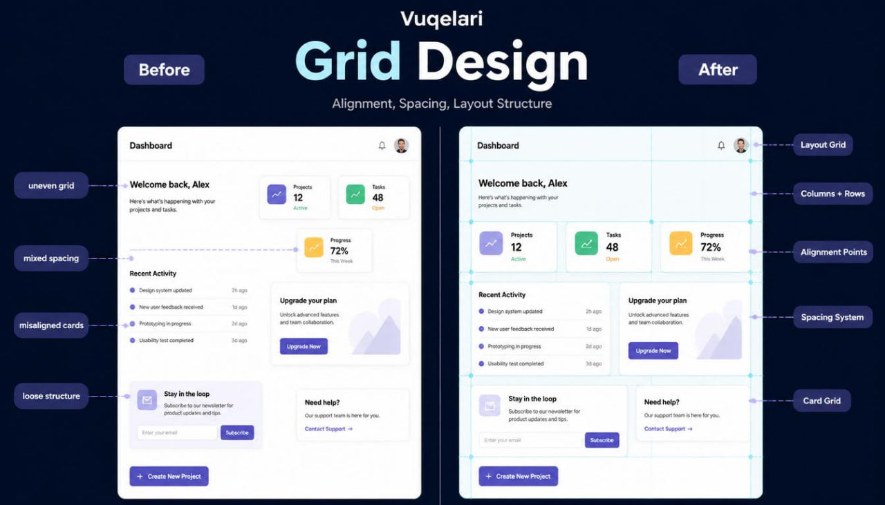
- Problem Statement
Many learners understand individual UI/UX topics, but they may still struggle to bring everything together inside one organized layout. A screen can include useful content, a visible action, and grouped sections, yet it may still feel uneven if alignment, spacing, and page rhythm are not planned carefully. Learners may also find it difficult to keep several sections visually connected when a page contains cards, text blocks, forms, notes, and action areas. Without a grid-based study method, interface layouts can become inconsistent from section to section. Grid Design was created to help learners study UI/UX design through layout structure, alignment logic, and detailed screen organization.
- Solution
Grid Design teaches learners how to use layout structure as a foundation for UI/UX planning. The course explains how grids, columns, rows, spacing patterns, alignment points, and repeated section rules can make interface layouts easier to study and review. Learners examine how content blocks fit together, how sections can follow a shared rhythm, and how actions can be placed within a steady visual structure. The materials include written modules, visual examples, planning tasks, and review checklists for self-paced study. This tier brings layout, flow, hierarchy, mapping, and repeated patterns into one organized study approach.
- What’s Inside
Grid Design includes a detailed set of UI/UX design materials focused on layout grids, alignment, spacing, and page structure. The first module introduces grid thinking in UI/UX design. Learners study how a grid can act as an invisible structure behind a screen. It helps place headings, text blocks, cards, forms, images, notes, and action areas in a more organized way. The course explains that a grid is not only a visual tool. It also helps the learner make decisions about page order, content grouping, and section balance.
The second module focuses on columns and rows. Learners explore how content can be arranged in single-column, two-column, and multi-section layouts without making the page feel scattered. This section explains when a single-column layout may fit a reading-heavy screen and when a wider structure may help compare information or group related blocks. Learners review examples where columns create order and examples where too many divisions make the screen harder to follow.
The next module studies alignment. Learners examine how left edges, center lines, card edges, form fields, labels, and action areas can line up across a screen. The course explains how alignment can make separate elements feel connected. When headings, text, cards, and actions follow shared alignment points, the page can feel more organized. When every section starts in a different place, the screen may feel unfinished or difficult to scan.
Grid Design also includes a module about spacing systems. This section explains how repeated spacing values can create a steady layout rhythm. Learners study spacing between headings and text, between cards, between form fields, between sections, and around action areas. The materials explain how spacing can show relationships: close spacing can connect related elements, while wider spacing can mark a new topic. Learners review sample layouts and identify where spacing feels too tight, too wide, or uneven.
A separate module focuses on section structure. Learners study how larger pages can be divided into introduction areas, main content sections, comparison blocks, forms, review areas, and closing actions. The course explains how each section can follow its own inner layout while still matching the full page structure. This helps learners understand how to build pages that feel connected from top to bottom.
The course continues with a module about card grids. Learners study how repeated cards can be arranged in rows or columns with consistent inner order. The materials explain how card width, spacing, heading length, description length, labels, and action placement can affect the full layout. Learners compare balanced card grids with uneven card groups and learn how repeated rules can help the screen feel more stable.
Grid Design includes a module about forms inside structured layouts. Learners study how labels, fields, notes, section titles, and action areas can fit into a grid-based structure. This part explains how form fields can be grouped by topic, how labels should stay visually connected to the correct field, and how action areas can close a section without interrupting the layout rhythm.
Another module focuses on page scale. Learners study how a small screen outline differs from a longer page with several sections. The course explains how larger layouts need repeated rules so the page does not feel like separate pieces placed together. This includes repeated spacing, matching alignment, steady heading structure, similar card logic, and predictable action placement.
The practical work in this tier includes several layout planning tasks. One task asks learners to place content blocks onto a simple grid. Another task asks them to review a page and mark alignment points. A third task asks them to adjust spacing between sections so the page rhythm feels more organized. Another exercise asks learners to plan a card grid with repeated headings, descriptions, labels, and action areas.
The tier includes three review checklists. The grid checklist asks whether the layout has visible structure, whether content blocks line up, and whether sections follow shared rules. The spacing checklist asks whether related items are close enough, whether different topics are separated clearly, and whether page rhythm feels steady. The alignment checklist asks whether headings, cards, forms, and actions share common placement points.
A glossary section is included with terms such as layout grid, column, row, alignment, spacing system, section structure, card grid, form layout, page scale, and layout rhythm. Each term is explained in plain UI/UX language with practical study context.
The recap section connects the main ideas into one review method: define the page structure, choose a layout direction, align related elements, apply steady spacing, organize repeated sections, and review the screen as one connected layout.
- Who Is This For?
Grid Design is for learners who want to study UI/UX design through detailed layout organization. It is suitable for people who already understand screen purpose, user flow, visual order, mapping, and repeated patterns, and now want to bring those topics together through structured layout planning.
This tier may fit learners who ask questions such as: Why does this page feel uneven? How should these cards line up? Where should the form sit inside the layout? How can several sections feel connected? How can spacing stay steady from top to bottom? The course gives learners a practical way to study these questions through examples, exercises, and review notes.
Grid Design is also suitable for self-paced study. The materials are not tied to named programs, operating systems, or third-party names. The focus stays on UI/UX design thinking, layout structure, spacing, alignment, and practical review.
- What You’ll Learn
- How to study layout grids inside UI/UX design
- How invisible structure can guide page planning
- How columns and rows shape screen organization
- How to choose between single-column and wider layout structures
- How alignment connects headings, cards, forms, and action areas
- How to notice uneven placement across a page
- How repeated spacing can create steadier layout rhythm
- How to separate topics with spacing without making sections feel disconnected
- How to organize long pages into structured sections
- How card grids can support repeated content blocks
- How to arrange headings, descriptions, labels, and actions inside repeated cards
- How to place form fields, labels, notes, and action areas inside a layout
- How page scale changes layout planning
- How to mark alignment points during interface review
- How to use checklists for grid, spacing, and alignment review
- How to connect layout structure with user flow, hierarchy, and repeated patterns
- 30-Day Refund Note
Vuqelari includes a 30-day refund window for orders that match the store policy conditions. Learners should review the course materials during this period and contact the team if the tier does not match their study needs. Refund requests are handled through the store’s regular contact process and may depend on order details, delivery status, and the policy information shown on the store page.
Self-paced learning overview
- 🗂️ Digital file available after purchase
- 📚 Long-term availability
- 🔒 Secure checkout
- 🗓️ Content updated in 2026
What format are the Vuqelari course materials provided in?
What format are the Vuqelari course materials provided in?
The Vuqelari course materials are prepared as digital learning resources for self-paced study. They include written modules, visual examples, practice tasks, checklists, and review sections.
Who are the courses made for?
Who are the courses made for?
The courses are made for learners who want to study UI/UX design through organized materials and practical exercises. Each tier has its own depth, from an introductory starting point to wider topic collections.
How do I study after placing an order?
How do I study after placing an order?
After placing an order, you receive the course materials through the store’s normal delivery process. You can study the modules at your own rhythm, return to earlier sections, and use the tasks for review.
Share